Tierra
An app promoting lifestyle changes towards sustainable living
Responsiblities: UX / UI Design Process
Client: CareerFoundry
Industry: Lifestyle and Environment
Platform: Native app - iOS & Andriod
Tools: Figma / Miro / Adobe Creative suite
PROBLEM
People want to live a sustainable lifestyle for the climate and to save energy, but are unaware how they can make this change
As the issues of climate change begin to impact everday life from energy and food costs to weather and housing, people are keen to transition to a more sustainable lifestyle to save money and to help the environment; however, the vast amount of information about sustainability has left people confused about how they can make this change and how they build sustainable habits for the future.
SOLUTION
An app that allows users to select tasks that track & promote sustainable living
The app would allow the user to do the following:
Select categories such as energy, water, transport etc which would show related sustainability tasks
They can save, record and track the progress of their tasks
Promote tasks and tips to their friends and family
COMPETITOR ANALYSIS
Competitor apps had cluttered UI’s and multitudes of tasks and information
A competitor analysis was made to understand key features of other sustainable apps on the market. Analysis included unique features, standard features, strengths and areas for improvement. The apps chosen were Ailuna, Capture and Earth Hero.
Competitor strength
Star reviews from users for each task /Step-by-step instructions to complete tasks/ Impact tally for all tasks completed /Visually striking colour scheme and illustrations Minimalist UI with clear coherent CTA’s /In-app gestures help user navigate UI Covers a variety of sustainable topics /Ability to share information to wider users
INSIGHTS AND OPPORTUNITIES
Key opportunities for differentiation
Minimalist UI that only displays information relevant to the user recording or completing a task
Separate sections for external topics like lobbying, petitioning and social activism
Clearly defined icons/illustrations which relay information quickly rather than relying on text heavy paragraphs
Competitor weakness
Cluttered UI/ Information is displayed in long lists / Visual hierarchy is not apparent/ No filters for tasks/Lack of information about community settings/Inconsistent colour schemes feels overwhelming
Key UI themes
Upon analysing the UI of the competitor apps, key UI themes emerged including:
The use of on-boarding journeys to explain the ethos and purpose of the app
Navigation hubs categorise key topics and information points
Task cards spotlight key details; icons are used to convey information easily
Dashboards track task status and progress
MOBILE USERS: WHAT THEY EXPECT
Mobile users are highly task oriented
White paper research was carried out to understand what mobile users expect from the apps they are using. The key findings from this research were broken down into Design & usability elements.
Source: https://martech.org/google-survey-what-users-want-from-mobile-sites/
USER MAP
Uncovering opportunities and user needs
Based on the characteristics of mobile users and the opportunities identified in the competitior analysis, a user journey map was made to identify user needs and opportunties. The opportunities identified were then translated into user needs.
Key Opportunities - Translated To User Needs
As a user I want to know the context of the sustainability app before I sign up
As a user I want a simple overview of what a sustainability task is and what it involves
As a user I want to customise my tasks
As a user I want to share tasks with my peers to spread the message of sustainability
As a user I want to see a dashboard of tasks that are in progress, saved and completed
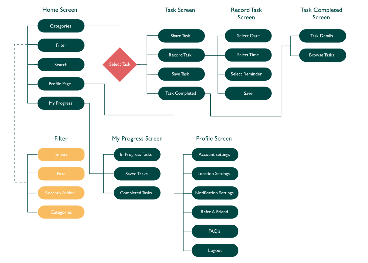
USERFLOW
Journeys without obstructions
An overall user flow was mapped out to ensure the user journey was intuitive, without obstruction and did not overwhelm the user with unecessary information or directions. A second flow was then made for essential screens.
IDEATION
Designing for Android and iOS
Crazy 8 design sketches were made to ideate key features screens. These were then translated into designs for Android and iOS.
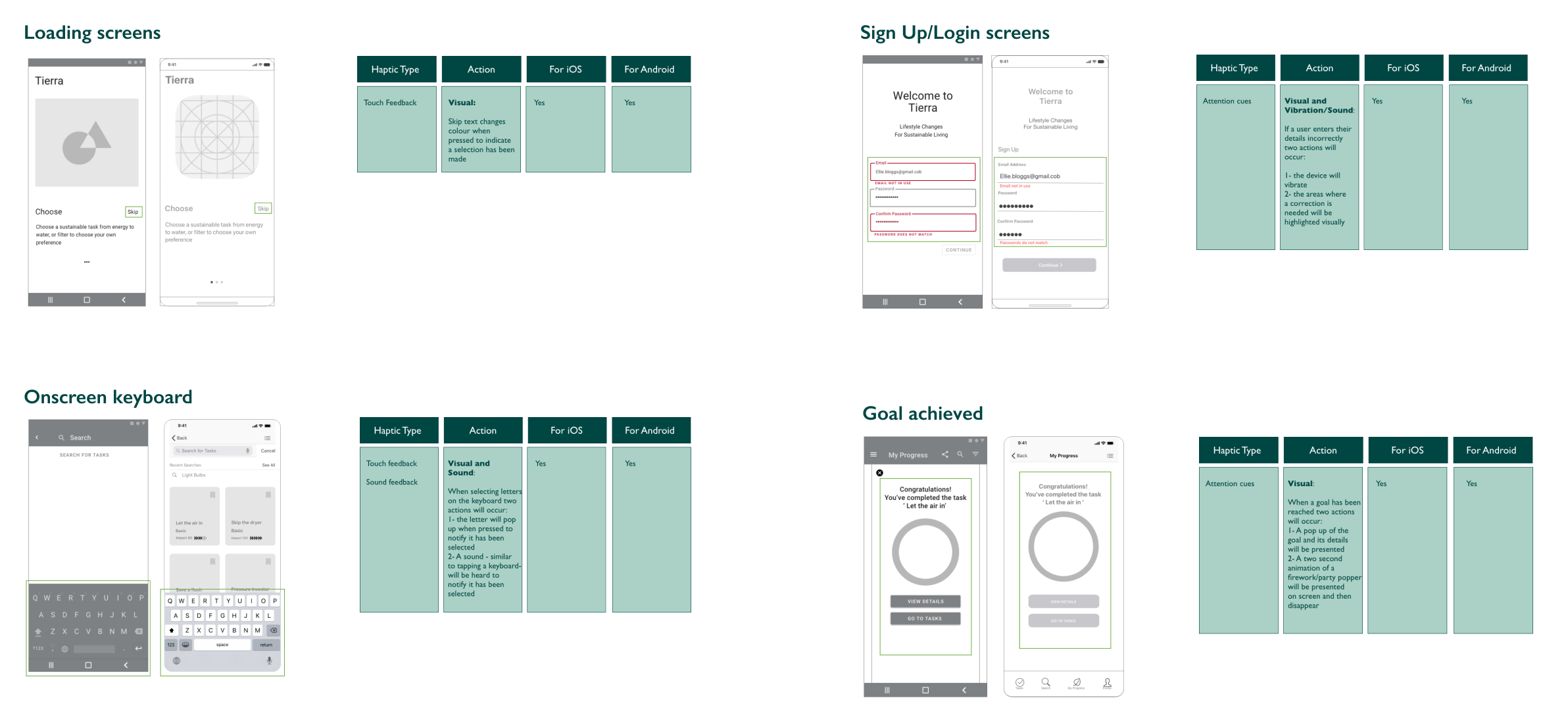
HAPTIC FEEDBACK
Designing for touch and sound
The next process was to define the sound and physical feedback for both the iOS and Android app screens. The screens below show these variations. Sound and Physical feedback ensure that the interactions on the app are not only visual but encompass sound too for a richer and varied experience.
Style Guide
Adding colour and illustrations
Upon studying the design of the competitor apps I realised that images that were not standardised in style led to the app feeling incoherent, and led to a less than appealing visual UI.
For this app I decided to solely use illustrations so that all images would be unified and would quickly convey to the user what was needed of them whilst also being visually appealing.
The colour choice is largely based on green hues and accents of yellow and coral for contrast. The choice of these colours were for harmony and their association with the earth.
A/B Testing
Selecting colour themes
An A/B test was conducted on the final designs to understand a colour preference for users. The results can be found below.
Users were asked for their colour preference for the Impact symbol. The secondary colour was chosen over the accent colour.
Users were asked for their colour preference for the Progress chart. The primary colour was chosen over the accent colour.
Prototypes
Tasks and Dashboards
Tasks are divided into categories for Energy, Water, Waste, Transport, Food & Drink and Shopping. These tasks are further divided into difficulty levels and impact
Dashboards show In-progress, saved and completed tasks
Onboarding and Sign Up
The onboarding journey guides users through the key functions of the app
The sign up page gives the user social media sign-up options
Reflections
Prioritisation
Sustainability covers a multitude of areas; prioritising and condensing these key areas into categories and then breaking these down into smaller tasks was challenging, but key findings from competitor apps helped to show which sustainable categories would help the user easily change their habits for a sustainable lifestyle.
Visual
When searching for images and illustrations for the app, I found it challenging to source those that were consistent in style and colour. Eventually I decided to create all the task images in Adobe illustrator. this helped give the app a consistent theme and look.
UX language
Most of the competitior apps had lots of information about sustainability, however, this information was often presented in long lists of texts. For this app, I wanted to ensure the user got the relevant information they needed in a succinct, easily digestable format. To overcome this challenge I used UX language techniques to ensure the language and context was to-the-point and not overly lengthy.
Additional Features
Feedback from users who were testing this app suggested a number of additional features; whilst it was interesting to hear this feedback, understanding which additional features to include proved challenging. This was resolved by creating a pole for users on which features were most popular and then adding these features to the app.


