NOW TV: Help Portal
An Online Help Portal /Community designed to reduce Live chat contacts and promote self-serve
Responsiblities: UX / UI Design
Client: NOW TV
Industry: Telecommunications
Platform: Web/Desktop
Tools: Figma / Jira / Adobe Creative suite
Timeline: 6 months
Brief
Develop a solution for reducing customers using the Live Chat service on the NOW TV website for common service queries.
Current Problem
Upon launch, the ethos of the NOW TV platform was to provide a digital-first customer service platform; this meant there were no call centres, and users were encouraged to contact NOW TV social media channels or access Live Chat to solve any issues they had.
This left many users who were not familiar with a digital first service, feeling frustrated and dissatisfied, which eventually drove a spike in complaints on the Live Chat service.
Solution
Create a Help Portal on the NOW TV website where users can access Help articles and an Online community to solve common issues.
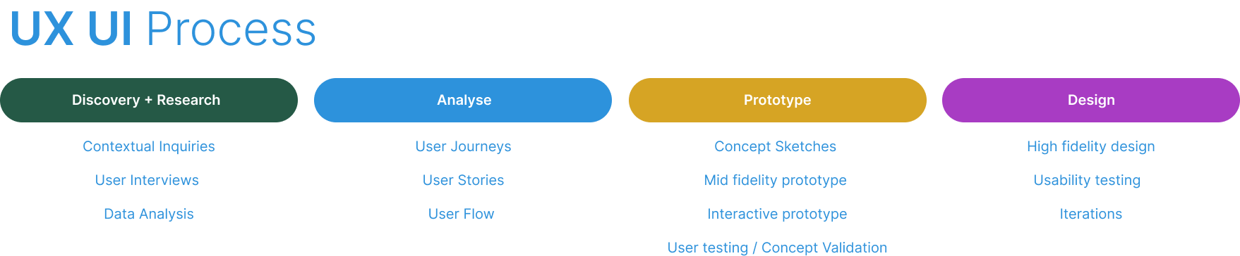
CONTEXTUAL INQUIRIES / DATA ANALYSIS
A deep dive into the problem
To understand how a solution could be formed for this brief the initial steps were to discover more about the current problem. For this, a contextual inquiry was initiated so we could observe customer service agents taking real-time live chats, with the goal to understand the nature of the chat and how the customer query is been resolved. Before a customer initiates a chat, a customer service agent can see where the customer has been browsing on the site to understand their journey.
We observed twenty chats in total. The findings from the chats were as follows:

CUSTOMER JOURNEY MAPPING
How can we improve touchpoints when providing a solution?
We created a customer journey map to build a better understanding of how customers find and interact with the service and to discover opportunities for improvement. The map revealed user problems and opportunities along the entire breadth of the journey. Therefore, we kept the entire journey in mind during the design process. Our goal during the customer journey mapping was to understand how the user feels when trying to find a solution to the issue they are experiencing, and pivot any negative feelings into postive affirming ones. For this purpose we examined the entire journey from entering the website to resolving their issue.
Identifying pain points
Upon looking at the pain points along the user journey, there were three classifications we uncovered; Interaction level pain points, Journey level pain points and Relationship level pain points. To build a user centered solution we looked at all three separately.
Interaction level pain points - When a user chats to an agent they maybe given different solutions for the same issue and may sometimes be cut-off and passed to a new agent having to explain their issue again.
Journey level pain points - The user does not know that they need to access a live chat to find a solution to their issue.
Relationship level pain point - As NOW TV is part of the Sky Broadcasting group users expect a service where they can choose how they solve their issue; e.g. phone service, help videos etc. rather than only having a live chat and social media option.

WORKSHOP 1
Ideating solutions for pain points
After the pain points had been established, myself a QA, Product Owner and a UX designer began ideating possible solutions to help users resolve their issues without using live chat as a first option. This process took the entire day. When ideating, we wanted to ensure the solutions mirrored those the users were familiar with; those they would have already been using with other services and providers, but, with an emphasis on self serve. In the end we came up with three solutions: Help articles accessed on a Help Portal, a User community and Prompts for Live chat for complex queries. We presented these solutions to higher management stating why we believed these solutions would meet the goal of reducing live chat numbers whilst also providing an increased and positive user experience. Higher management gave the solutions a green light, after which we worked on user journey mapping to bring the solutions to life.
Constraints
We had constraints we had to keep in mind when developing a solution for this problem, which included:
Platform functionality: large videos and images would increase page loading times
Costing: The company wanted to reduce costs by scaling down live chat agents so users could self serve. Our solution would need to meet this objective

DATA ANALYSIS
Content discovery and governance
To understand the content needed for the Help articles, the Community and for Live chats, we gathered data from Live chats, engineers and from the complaints team; our goal was to make sure we covered technical and account related solutions which could be broken down into high level topics followed by steps for recovery. Once we had the high level topics we began the process of creating user story maps to define how this information would be presented to the user and how the information would be visually designed.

USER FLOW
User Decision points
After the user story maps were created, this gave us - UX designer and I - a solid foundation upon which to start mapping user flows for the Help portal.
The goals of the user flow are as follows:
To understand how user goals align with the interactions on the Help portal
To understand if the flow is aligned
To understand if the flow has obstructions
To understand if new /existing interactions need to be considered

IDEATION
Concept sketches for Help Portal and Community
Once the user flow had been defined we took this information and began working on concept sketches for how the Help portal would be designed. When designing the portal we took our lead from best practice for designing help pages, and in keeping the style consistent with rest of the pages on the NOW TV website. We iterated numerous designs to cover a breadth of design options; a design critique was held where all parties came to a consensus as to the final design we'd take through to create a prototype for testing.
Key features for the Help Portal
A large search bar featured on the Help article pages and on the Community page. The search bar would provide prompts for help article/community searches
Users can tab between Help articles and the community
A Breadcrumb navigational component is displayed when users access an article or post so they know their page location
Filter tags allow users to hone in on specific topics for both articles and posts
A Live chat prompt is presented on the lower right of the screen after the user has been on one page for more than ten minutes

TESTING PROTOTYPES
Usability test objectives
Usability tests were made by an external agency using paper prototypes we had created and provided to them. Our collective objectives for these tests were to ensure the following:
Users understand where they can access the Help Portal
Users understand how to search solutions
Users understand how to access and perform recovery steps in Help articles
Users understand how to navigate the community
Users understand how to post on the community
Key findings from usability tests:
Users understand where they can access the Help Portal
100% of users understood where they could access the Help Portal. Further suggestion: Community should be labelled separately from the Help portal for clarity
Users understand how to search solutions
70% of users understood that the search bar can be used directly to search for solutions
Users understand how to access and perform recovery steps in Help articles
Help articles to include visuals and videos where possible; large text articles left users feeling overwhelmed
Users understand how to navigate the community
80% Users who had already used communities, and those that had not, felt comfortable navigating the community
Users understand how to post on the community
80% of users felt comfortable knowing how to post on the community
Further Key Insights
Filters - filters for specific topics left users confused when used in conjunction with the main Help topics and the Search bar. In this instance they were omitted from the first iteration of the design, with the possibility of a future introduction if needed
Similar articles - the wording 'similar articles' for articles related to the main help categories caused users to remain in a loop without a clear issue resolution; therefore these articles were omitted from the help portal and the community
Final Designs
User First/ Intuitive Interface / Minimal Pain Points/
Taking the feedback from the usability tests the final designs were created with a focus on resolving the pain points highlighted in initial research and providing an intuitive, user-first design. Key components for the design included:
Popular query types highlighted as Top five articles on the Help Portal and community
Help Portal and Community positioned as a primary help resolution; Live chat is secondary
User has three options for issue resolution: Help Portal, Community and Live chat ( as opposed to just live chat)
Design choices
Both the Help Portal and the Community are designed using hues of blue that reflect the brand colours of NOW TV
The Help portal and the Community use different hues of blue to visually differentiate to the user
Minimalist icons are backed onto a blue background to add variety and visual recognition
Helvetica is used throughout both sites for consistency and clarity
Gradients are used on the Header and footer for visual appeal
Breadcrumbs are used as a Navigational component to ensure the user understand their page location and setting
Text containers use an accordion to display themed articles preventing cognitive load of too much text displayed at once

Prototypes
Help Portal
Community
Key features of the Help Portal
A large search bar featured
Tab between Help articles and the Community
Breadcrumb navigational component
A Live chat prompt for complex queries
Key features of the Community
Popular queries and posts displayed on Home page
A large search bar
Tab between Help articles and the Community
Breadcrumb navigational component
Users can see post views, comments and date
Filter between community posts
USABILITY TESTING
Assessing product viability and efficiency
To understand if the Help Portal and Community met the objectives of reducing live chat contacts whilst also resolving user issues, the Help portal and community were released to a 1000 staff members in a contained product trial for three months. The aim of this trial was to assess the following:
To track improvements of the experience over time using data and user surveys
To determine whether or not design changes are having a positive impact on the experience by asking users to score their experience
To show how much design contributes to business goals, like cost savings
The results of the trial can be found below:
70%
Decrease in Live chat contacts
80%
Positive Net Promotor Score
85%
Issues solved via Help Portal
& Community
60%
Increase in user engagement
Reflections
I learned
What users say they want versus how they behave when you provide a solution is not always correlated. When conducting user tests some users just preferred using Live chat to solve an issue as they wanted to engage personally with an agent; whilst this behaviour was not totally unexpected the realisation that changes are often attitudinal and behavioural and can take time to embed was a valuable lesson to learn for understanding user behaviour for future projects.
Balancing the needs of the business which included cost savings, improved user engagement and reduced Live chat contacts, whilst also ensuring the visual appeal of the Help Portal and Community was no easy task. However, I learned that taking a balanced approach to all stakeholders and communicating when certain ideas were not possible is vital in ensuring the project stays on course.
I would change
During this project, and due to time pressure, there were many stages of the design process that were deemed uneccessary, such as data metrics, personas and competitive analysis. I learnt that when designing for large companies they often want to fail-fast, iterate and learn. This is not a process I was used to, but ultimately not going through all the design processes and instead working with the design processes we had allowed me to be more creative and fluid when working with constraints. Ultimately I would change my mindset from being process driven to defining the process to suit the needs of the project.